Tuesday, May 26, 2009

The Garden Gate

I was going to call this "Beyond the Pale". Maybe if I fix it up, I will. Our apartment has a nice little patio and the gate at the back has always interested me because it has acquired a really weathered look and I like to see the green trees behind it, showing through the planks. Anyway, I sat down this evening and decided to capture it in WC pencil.

Oddly enough, the photos that I took gave it two different hues and I'm not sure which I prefer. Will have to decide, I guess, when I decide to make a real painting of it. So tell me, which do YOU prefer? Oh, and I decided to post a reference shot of the gate. I often wonder how artists decide which colors to use when they're painting a boring brown or grey gate... now I have a better idea... the colors that just "make it right".

And yeah... the blue flowers have to go.

Friday, May 22, 2009

Learning to draw

I've tried several texts for teaching myself to draw, from "Drawing for Dummies" to "Drawing on the right side of the brain". Of course, any program is only as good as the effort that you put into it! So you can guess where all of those led...

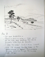
Found "How to draw anything" in a bookstore the other day. What immediately grabbed my attention was the fact that the author started you out copying some of his sketches, and the assumption that these are simple. For instance, he says, of the first sketch, "Begin with the very simple illustration in figure 5." Well, my brain didn't think it was that simple, but I went right in, concentrated on the lines and... hey presto!... ended up with a passable sketch! The next assignment was to shade it, which I did, and I feel very pleased with the result. Obviously, this wasn't my interpretation of the scene, but just drawing distant fields with squiggles, hills with slight curves, and closer trees with squiggly outlines gave me a lot of "aha!" moments. I finished the next two assignments and they're all below.

I've also signed up to take a drawing class that starts in a couple of weeks, so I hope that between personalized attention, the use of this book, and the skills that will come with the WC pencil class, I will begin to make progress.


Playing with WC pencils -- rainbows and mixes

Kate said: Play with your pencils. So that's what I did. :)

First I looked carefully at the color charts and picked a warm and a cool of each color. (I chose two warms and cools of the reds.) Colors:
Cool yellow: Staedtler; Warm yellow: FC dark cadmium
Cool blue: D prussian; Warm blue: D helioblue-reddish
Cool red: FC alizarin crimson / D crimson lake; Warm red: FC deep red / D deep vermilion

The top row shows the colors opposite each other. I pulled color from each one into the middle. Can't say I found this effective, so I need to learn how to do this better.

Second row: I crosshatched each color with the other and then wet a part of each. B over Y; B over R; Y over R.
Third row: Same thing, only I changed the top and bottom colors.

I decided that I liked the green that I got in the left column, as well as the purple in column 2 and the orange in column 5, so I used those colors to make the color wheel. The blobs of orange, green, and purple at the outside of the circle are the mixtures.

Next step was to find pencils with that matched the 3 secondary colors, which I did. I used those colors on the inner part of the circle.

[What I've now ended up with are nine pencils (6 primaries, 3 secondaries) that I can grab and take with me on the road. I'll also add 3 or 4 neutrals and with this I should be set for trips, along with a sketchbook, paper towels, and waterbrush. I plan to continue experimenting with all the pencils at home, of course.]

I also experimented with tertiary colors, using the secondary pencil colors between each of the primary colors. I hope this makes sense.

Lastly, I became fascinated with the idea of rainbows so along the bottom of the paper I lightly sketched in six lines of each color, adding the next color to it after line 4, so that there was always overlap, then wet the bottom.

I had so much fun with this :) that I decided to try it out in a sketchbook with roughish paper and one with very smooth paper (70 lb) -- I really like that one! (I also cheated by finding a couple more greens to ease the transition between yellow and green... that was really bugging me.)


Playing with WC pencils -- charts

Okay, I did what I always resisted doing with my WC tube paints: made a color chart, and have uploaded them. Here's how the charts read, left to right:

Column 1: pencil pressed heavily, forwards and back.
Column 2: pencil pressed as lightly as possible, once.
Column 3: pencil pressed fairly heavily, as though writing.
Column 4: paint taken off the pencil
Column 5: information about the pencil (brand and color)

The brands are:
Staedtler (no color or other info given)
FC (Albrecht Durer Faber-Castell) + color name + number
D (Derwent) + color name + number
D-Ink (Derwent Inktense) + color name + number


Watercolor pencils -- let the fun begin

I just joined the Watercolor Pencils online class offered by Kate Johnson. I'm looking forward to this and it was very timely given that just a month or so ago I began playing around with WC pencils. The class promises to be great (!) and I expect to develop skill with this medium. So far, a couple of things I've noticed:
1. Coming from a WC background, I want to wet everything. So I'll need to learn when it's okay to create various washes, and when it's okay to let the pencil texture shine through. And this should, I imagine, be a different effect from mixed-media use of colored pencils on WC. ??
2. Do I crosshatch everything? Just color things in? Use the pencils as pencils, or slightly flatter? Okay, will pursue these questions as well.

Several posts follow, along with pix.