Monday, November 12, 2012

Purple bowls?

A colleague likes purple, so I made these "bowls" for her. Needless to say, I started them some time ago (at least it was this year!), and finished them up last night. I used a pretty basic pattern for the base and sides.  The relative sizes show up much better in the top photo; the purple bowl is really not as big as it looks in the bottom photo.

To make the big bowl a bit sturdier (and also to link all three together), I crocheted the sides using both light and dark purple yarns together. I like! I hope she does, too. 


My clapochet -- just in time for fall

I can't believe that it's already nearly mid-November. Where has the time gone? I finally finished this clapochet last night, having begun it in (ahem) December 2011!! It feels and looks really nice. I'll post information on Ravelry eventually, but here are some key facts: Yarn: Paton's lace "Midas" (85g, 498 yards, and I used almost the entire skein); Hook: Boye F (5 mm), crocheted very loosely; pattern from Crochet Kitten at http://crochetkitten.blogspot.com/2009/02/clapochet.html . I made a few changes and corrections to the pattern, but otherwise went with the treble crochet on the diagonal. I love this!

Monday, June 18, 2012

Displaying my art at work

A colleague suggested an art show at work where interested people could display up to three examples of their work. Needless to say, I jumped at the opportunity to think about what art, in its many forms, means to me. Unfortunately, readers of this blog won't be able to see the entire gallery since it's on our institutional wiki site, but my work and my statements aren't copyrighted, so here they are.

About the Artist 

Like most other people, I took art classes in school, but for several years my main interest was photography (I loved my old Pentax K1000). Although nowadays I explore the creativity possible with digital photography and software, I find myself increasingly using my shots as reference photos for other forms of two-dimensional art. My foray into other forms of art began many years ago with pastels, followed by watercolor, which was my main interest for about 15 years. In 2008, a class in watercolor pencil led to a growing interest in this medium, and ultimately explorations in colored pencil. While I miss the looseness, fluidity, and unpredictability of watercolor, I enjoy and benefit from the precision and tightness possible with pencils (watercolor, dry, or graphite) and find them a valuable balance for other elements in my life.

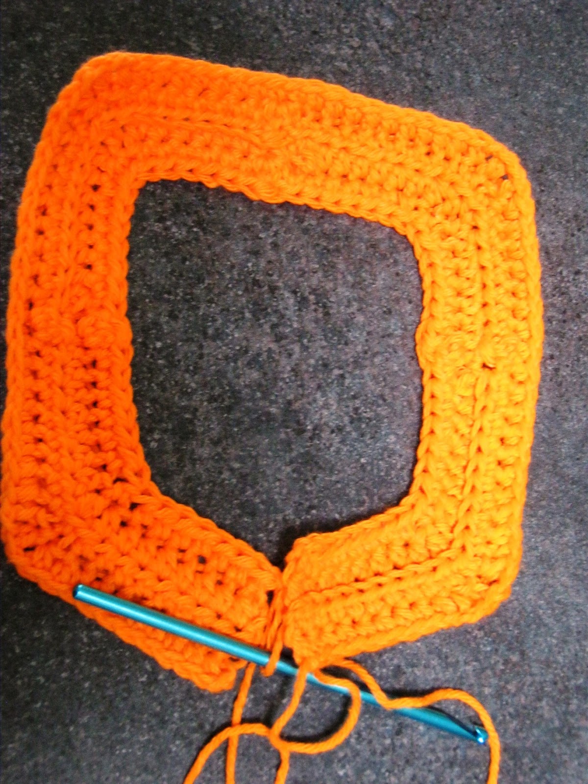
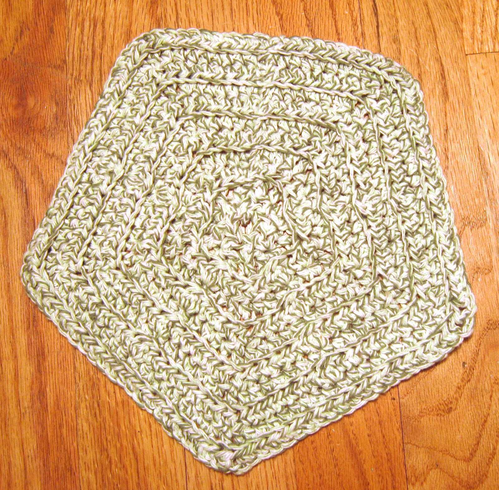
Quite by chance, I picked up a crochet needle in 2007 for the first time in umpteen years, and now often relax with the soothing and rhythmic process of making "things". What I especially love about it is the ease with which I can modify a pattern, or simply experiment with a needle and yarn. I have been "hooked" on Tunisian crochet since about the same time as well, fascinated by the way that crochet stitches can create a variety of looks; I am currently exploring ways to "weave" and blend colors. This is probably the only medium in which I create abstract objects.

My introduction to book arts came in 1997 when I worked at Whitman College, with a week-long class taught by Gary Frost, and I haven't looked at a book in the same way since. What a marvellous technology the simple codex is! I was fortunate enough to take a workshop on Coptic bindings with Lisa Heller, created many books for friends, and ended up teaching the Coptic-binding section of the book arts Spring semester course during my last three years at Whitman. I use primarily one needle but intend eventually to develop expertise using two needles.

Dee's works on display

Coptic sewing -- a model
This was a model that I used when teaching to demonstrate how easy it is to add interest to a binding.

Materials used: Linen weave paper (resume), Davey board, Italian paper for cover and endpapers, embroidery floss.


Sun, grass, sea
Here is an example of what I call the "woven" technique in Tunisian crochet. This began as an experiment to create a subtle rainbow, but like so much else, it evolved into something quite different, hence the haiku. Although it is unusual to flatten yarn behind glass, I believe that this enhances it by reducing its three-dimensional nature.

Planet Earth Haiku
Brightly burning sun
Grass that is lush, green, and long
Cool waters below

Materials used: Embroidery floss.


Boats by moonlight
This colored-pencil painting on colored paper is based on a photograph that I took a few years ago in Barbados. The watercolorist in me is still amazed at the idea of adding rather than saving the white.

Materials used: Colored paper, colored pencils.

Sunday, April 15, 2012

Let's add crochet to this blog

Dishcloth
Yup. I've begun crocheting again. Dishcloths are a great way to practise new stitches and also get back into the groove. So here's a new contribution to the world of cleanliness! This is based on the type of mitered square that starts at the outside and works its way in, gradually decreasing. (There are others where you start with a couple of stitches and the square "grows".) I was very unhappy with one that I found recently since the resulting fabric, worked in single crochet, was not a square. It occurred to me that using half-double-crochet would help to expand it a bit.

First few rows -- close up

Since seams are often noticeable, I tried to get around that by creating a bit of texture in the middle of each segment, thus minimising the "different" look of the seam.

First few rows

As I worked on one (see pix of the growing cloth), it became clear that it was dying to become a pentagon -- but I forced it into a square, nonetheless. :)
Wants to be a pentagon; needs to be a square

Nearly there; need to close those jaws


Of course, the next step was to make a new one, this time allowing it to follow its natural inclination. I liked how this worked. So after this, it was one in green for my friend V.

The final pentagon -- so happy!

I really like how this pentagon worked out. It will be great for cleaning up my kitchen.


Dishcloth for V. I hope it matches her kitchen!

Monday, October 31, 2011

Backgrounds -- Put Your Art in Context

Still with Laure's class. More assignments follow in my blog, though the class has now ended. Laure taught us about the importance of backgrounds... planning them, perhaps putting them in first, not making them an afterthought. One exercise was to build our "vocabulary" of backgrounds by creating several, whether inspired by fabric, wallpaper, rugs... whatever.

Next, we put several items together, having planned the background first. I took the cherries that were used in the assignment -- wanted to show black cherries, standard red ones, and then Rainier cherries. Hmmm... not sure if that worked!

Sunday, October 9, 2011

Artful Journaling #6 and #7

Word Art: AJF 6
I'm behind on my assignments for my Artful Journaling class. Each assignment is more challenging than the previous ones. The two here are "Word Art" and "Designing Borders". It was very difficult for me to let go and actually design a word for myself, but as soon as I thought of "laugh", it all came together. The word, that is... not the background, colors, or anything else. Still, I think that it's pretty lively.


The borders were fun. I really got into a zone here, while discovering just how much I love pen and watercolor work. We had to create at least two borders each of watercolor only; pen only; watercolor and pen. Well, I went a bit overboard. Our next assignment is to design a piece with the border as a part of the design but not overpowering it. I think I know what I want to paint, and I can already see which border or variant I'll pick.

Monday, October 3, 2011

Cantaloupe on a Plate

As part of my Artful Journaling Foundations class, I painted this as an assignment. Here's what I originally posted on the class page but then decided to put on this blog instead, with just a short reference over there. The class page can get very long when we all post...


I love cantaloupe, so my choice this time was very easy. (My cats also love cantaloupe, but they had no say in this.) I wanted to create a bit of tension in the painting, so I deliberately changed the directions of the three key elements -- cantaloupe, plate, lines -- to be slightly different. I think that in fact the painting looks more unified as a result, without the tension I'd hoped for. Oh well.

My line widths were broken (cantaloupe edges); narrow (plate edges); and thick (lines of fabric as well as border). I thought about extending the thick border all the way up and across the top, but I thought it might make the colorful part too top-heavy. I'm glad now that I didn't do that. I went with the vertical format not just because I liked how the photo looked, but because I really needed the height to create the upward thrusts. Once I'd decided on this approach, I tried a couple of thumbnails to see if they would work. As soon as I added the dark lines, the image just popped for me, and I decided to incorporate them.

The biggest challenge was the color of the cantaloupe. I kept seeing "orange" but it was far more than that. I layered it a couple of times to get the right sort of color and contrast. Next, the shadows. I kept them cool as a contrast to the warm cantaloupe. They're a bit too bland for my liking, but on the other hand, they don't detract from the focus, which I want to be the cantaloupe and the patterned fabric. (Actually, I don't think of it as fabric, but I'm not sure what else to call it.)

The black border over "cantaloupe" is to hide the paint that strayed from both directions, since my brush picked up some cat hairs and dragged paint around before I realised what was happening. :) I considered doing the same for the outer edges of the plate, but thought it would give too much weight where I didn't want it to be, and would visually separate the cantaloupe from the colors more than I wanted.

I really like the colors at the top. Mixed three puddles of blue, yellow, red, then dipped into each one to get a variegated pattern. Unfortunately I wasn't able to keep the blue and red as pure as I wanted, but perhaps that's not so bad, since now they're more muted.

I'm not happy with the word "cantaloupe" at the bottom. I colored in each letter with the same colors at the top, then put green over it. Maybe I should have painted a very dark color around the letters. I also put a light wash of yellow over the plate to remove some of the starkness of the white -- also because some yellow paint got onto the plate and I couldn't get it completely removed!! I don't know if the yellow shows up very well in the scan.

Fun assignment!