Sunday, April 15, 2012

Let's add crochet to this blog

Dishcloth
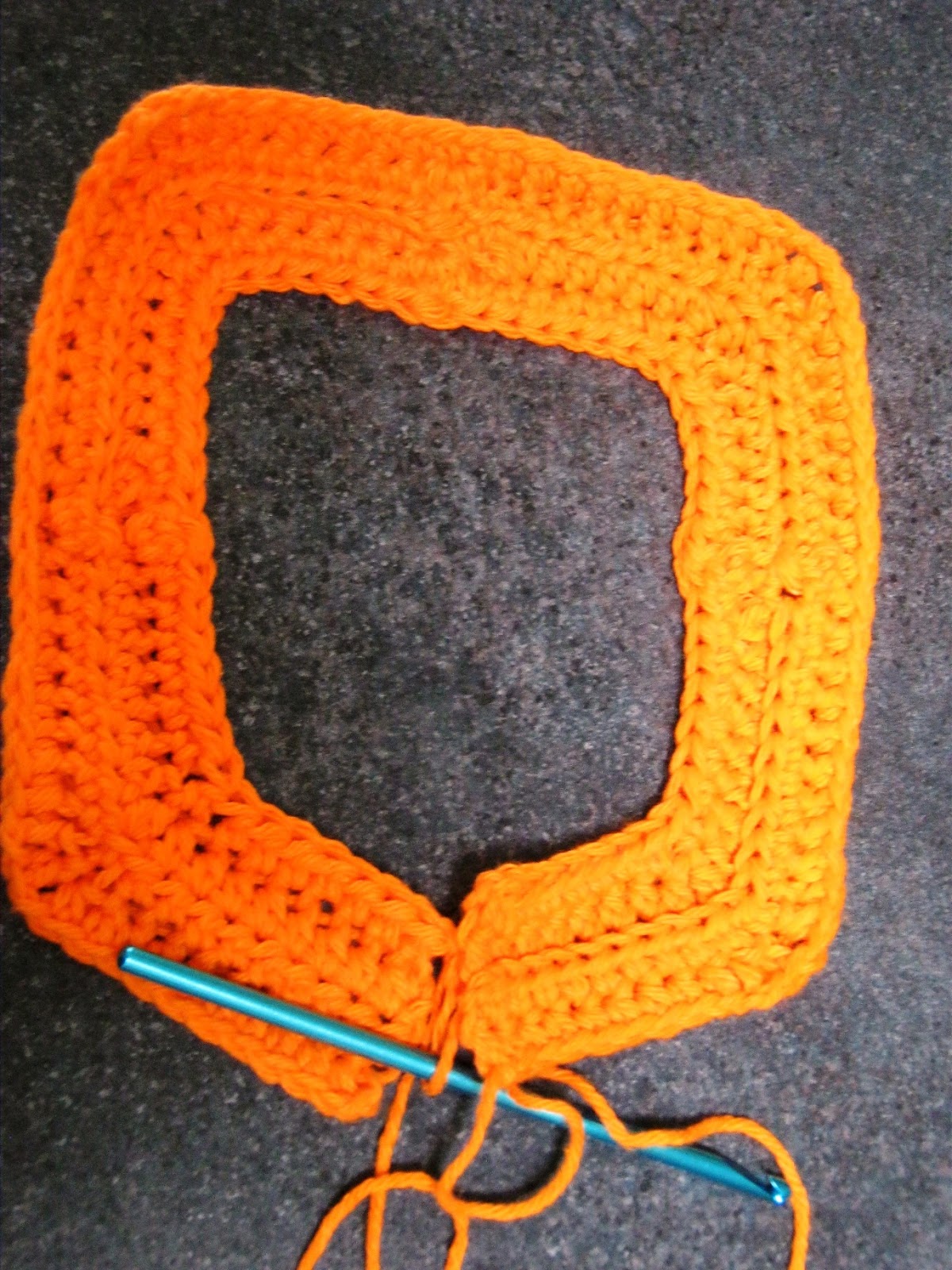
Yup. I've begun crocheting again. Dishcloths are a great way to practise new stitches and also get back into the groove. So here's a new contribution to the world of cleanliness! This is based on the type of mitered square that starts at the outside and works its way in, gradually decreasing. (There are others where you start with a couple of stitches and the square "grows".) I was very unhappy with one that I found recently since the resulting fabric, worked in single crochet, was not a square. It occurred to me that using half-double-crochet would help to expand it a bit.

First few rows -- close up

Since seams are often noticeable, I tried to get around that by creating a bit of texture in the middle of each segment, thus minimising the "different" look of the seam.

First few rows

As I worked on one (see pix of the growing cloth), it became clear that it was dying to become a pentagon -- but I forced it into a square, nonetheless. :)
Wants to be a pentagon; needs to be a square

Nearly there; need to close those jaws


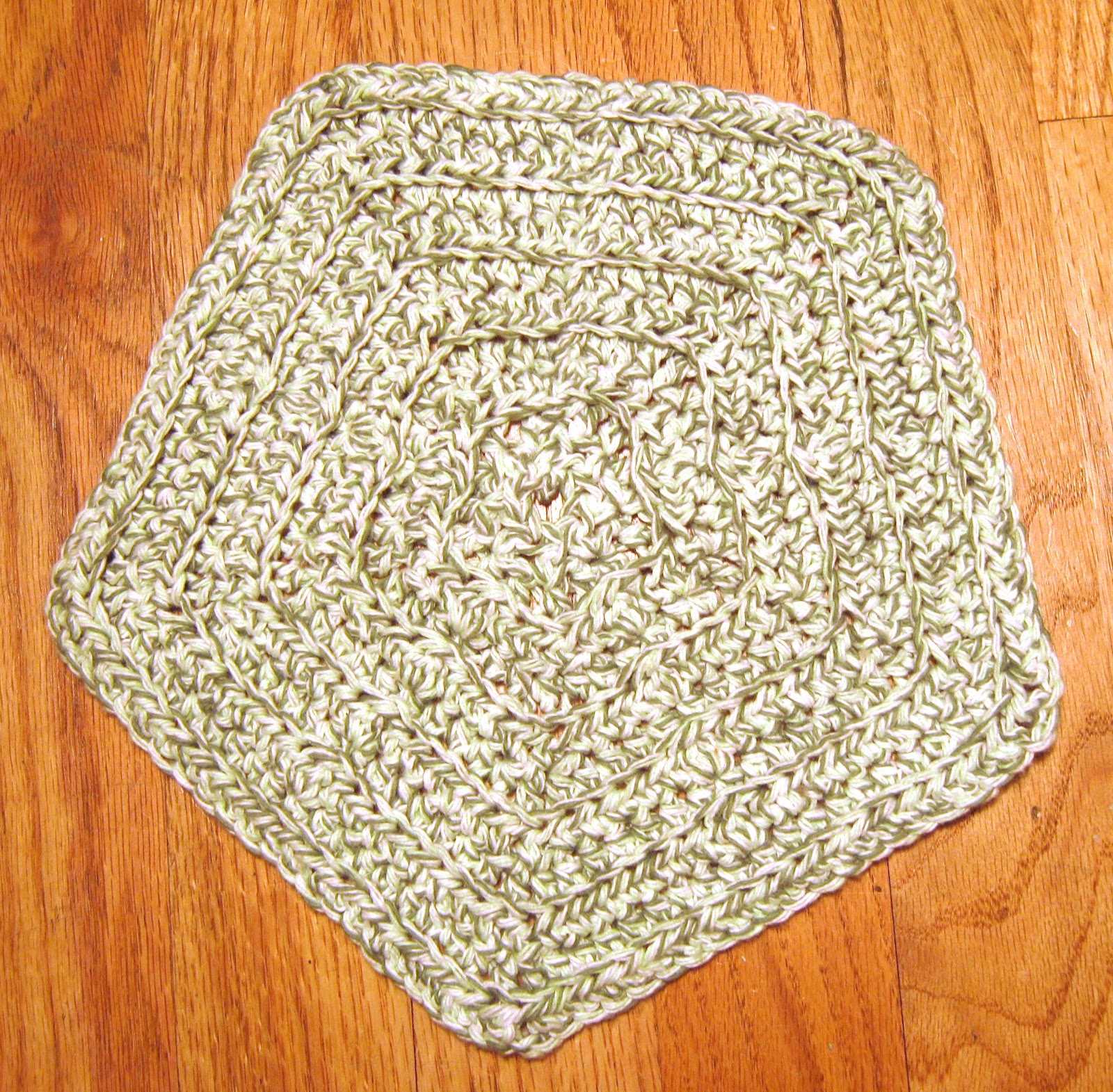
Of course, the next step was to make a new one, this time allowing it to follow its natural inclination. I liked how this worked. So after this, it was one in green for my friend V.

The final pentagon -- so happy!

I really like how this pentagon worked out. It will be great for cleaning up my kitchen.


Dishcloth for V. I hope it matches her kitchen!

Monday, October 31, 2011

Backgrounds -- Put Your Art in Context

Still with Laure's class. More assignments follow in my blog, though the class has now ended. Laure taught us about the importance of backgrounds... planning them, perhaps putting them in first, not making them an afterthought. One exercise was to build our "vocabulary" of backgrounds by creating several, whether inspired by fabric, wallpaper, rugs... whatever.

Next, we put several items together, having planned the background first. I took the cherries that were used in the assignment -- wanted to show black cherries, standard red ones, and then Rainier cherries. Hmmm... not sure if that worked!

Sunday, October 9, 2011

Artful Journaling #6 and #7

Word Art: AJF 6
I'm behind on my assignments for my Artful Journaling class. Each assignment is more challenging than the previous ones. The two here are "Word Art" and "Designing Borders". It was very difficult for me to let go and actually design a word for myself, but as soon as I thought of "laugh", it all came together. The word, that is... not the background, colors, or anything else. Still, I think that it's pretty lively.


The borders were fun. I really got into a zone here, while discovering just how much I love pen and watercolor work. We had to create at least two borders each of watercolor only; pen only; watercolor and pen. Well, I went a bit overboard. Our next assignment is to design a piece with the border as a part of the design but not overpowering it. I think I know what I want to paint, and I can already see which border or variant I'll pick.

Monday, October 3, 2011

Cantaloupe on a Plate

As part of my Artful Journaling Foundations class, I painted this as an assignment. Here's what I originally posted on the class page but then decided to put on this blog instead, with just a short reference over there. The class page can get very long when we all post...


I love cantaloupe, so my choice this time was very easy. (My cats also love cantaloupe, but they had no say in this.) I wanted to create a bit of tension in the painting, so I deliberately changed the directions of the three key elements -- cantaloupe, plate, lines -- to be slightly different. I think that in fact the painting looks more unified as a result, without the tension I'd hoped for. Oh well.

My line widths were broken (cantaloupe edges); narrow (plate edges); and thick (lines of fabric as well as border). I thought about extending the thick border all the way up and across the top, but I thought it might make the colorful part too top-heavy. I'm glad now that I didn't do that. I went with the vertical format not just because I liked how the photo looked, but because I really needed the height to create the upward thrusts. Once I'd decided on this approach, I tried a couple of thumbnails to see if they would work. As soon as I added the dark lines, the image just popped for me, and I decided to incorporate them.

The biggest challenge was the color of the cantaloupe. I kept seeing "orange" but it was far more than that. I layered it a couple of times to get the right sort of color and contrast. Next, the shadows. I kept them cool as a contrast to the warm cantaloupe. They're a bit too bland for my liking, but on the other hand, they don't detract from the focus, which I want to be the cantaloupe and the patterned fabric. (Actually, I don't think of it as fabric, but I'm not sure what else to call it.)

The black border over "cantaloupe" is to hide the paint that strayed from both directions, since my brush picked up some cat hairs and dragged paint around before I realised what was happening. :) I considered doing the same for the outer edges of the plate, but thought it would give too much weight where I didn't want it to be, and would visually separate the cantaloupe from the colors more than I wanted.

I really like the colors at the top. Mixed three puddles of blue, yellow, red, then dipped into each one to get a variegated pattern. Unfortunately I wasn't able to keep the blue and red as pure as I wanted, but perhaps that's not so bad, since now they're more muted.

I'm not happy with the word "cantaloupe" at the bottom. I colored in each letter with the same colors at the top, then put green over it. Maybe I should have painted a very dark color around the letters. I also put a light wash of yellow over the plate to remove some of the starkness of the white -- also because some yellow paint got onto the plate and I couldn't get it completely removed!! I don't know if the yellow shows up very well in the scan.

Fun assignment!

Saturday, September 17, 2011

Not Your Average Watermelon

I'm taking a class with Laure Ferlita called "Artful Journaling". The goal of the class is to develop confidence and skills in journaling. Materials are watercolor paints (limited palette) and a waterbrush. Our second assignment is to paint from a reference photo. Laure had a very nice technique for painting this slice of watermelon, and I'm very pleased with the variation of color that resulted. Not so happy, though, with the rest of the painting. The hardest part for me was working with the waterbrush. Perhaps I need to squeeze continuously while painting -- I found that my ink dried far too fast. Additionally, it wasn't as easy to clean my w/brush as I'd expected. (I've been using w/brushes for about 12 years, having purchased my first one at a Chinese store in San Francisco last century. But I've never attempted to use them the same way I'd use a regular w/c brush. I've thought of them as mere sketching tools.) I ended up using TWO brushes... one that had no regulator, so once it was held upside-down, the water slowly came out; and my frustrating brush, which I used to mix paint. Wish I could dig up my other w/brushes.

Saturday, September 10, 2011

SIxty Years of Marriage

Congratulations to my parents, who just celebrated 60 years of marriage. That's an achievement, no matter how you look at it. Enduring love, an example of loyalty, strong values, and commitment. Thanks, Mom and Dad!

Oh yes, I also painted a planter. The real one is a bit more squat than this, but I'm pleased with this pen-and-ink work.

What Color is Orange?

Orange is a mix of warm red and warm yellow. Red and yellow. This flower was an extremely intense orange color. It wasn't red, yet it had a depth of color that I haven't been able to replicate. Tried it with watercolor pencils and plain w/c. It's a challenge to capture just the right color!