Monday, October 31, 2011

Backgrounds -- Put Your Art in Context

Still with Laure's class. More assignments follow in my blog, though the class has now ended. Laure taught us about the importance of backgrounds... planning them, perhaps putting them in first, not making them an afterthought. One exercise was to build our "vocabulary" of backgrounds by creating several, whether inspired by fabric, wallpaper, rugs... whatever.

Next, we put several items together, having planned the background first. I took the cherries that were used in the assignment -- wanted to show black cherries, standard red ones, and then Rainier cherries. Hmmm... not sure if that worked!

Sunday, October 9, 2011

Artful Journaling #6 and #7

Word Art: AJF 6
I'm behind on my assignments for my Artful Journaling class. Each assignment is more challenging than the previous ones. The two here are "Word Art" and "Designing Borders". It was very difficult for me to let go and actually design a word for myself, but as soon as I thought of "laugh", it all came together. The word, that is... not the background, colors, or anything else. Still, I think that it's pretty lively.


The borders were fun. I really got into a zone here, while discovering just how much I love pen and watercolor work. We had to create at least two borders each of watercolor only; pen only; watercolor and pen. Well, I went a bit overboard. Our next assignment is to design a piece with the border as a part of the design but not overpowering it. I think I know what I want to paint, and I can already see which border or variant I'll pick.

Monday, October 3, 2011

Cantaloupe on a Plate

As part of my Artful Journaling Foundations class, I painted this as an assignment. Here's what I originally posted on the class page but then decided to put on this blog instead, with just a short reference over there. The class page can get very long when we all post...


I love cantaloupe, so my choice this time was very easy. (My cats also love cantaloupe, but they had no say in this.) I wanted to create a bit of tension in the painting, so I deliberately changed the directions of the three key elements -- cantaloupe, plate, lines -- to be slightly different. I think that in fact the painting looks more unified as a result, without the tension I'd hoped for. Oh well.

My line widths were broken (cantaloupe edges); narrow (plate edges); and thick (lines of fabric as well as border). I thought about extending the thick border all the way up and across the top, but I thought it might make the colorful part too top-heavy. I'm glad now that I didn't do that. I went with the vertical format not just because I liked how the photo looked, but because I really needed the height to create the upward thrusts. Once I'd decided on this approach, I tried a couple of thumbnails to see if they would work. As soon as I added the dark lines, the image just popped for me, and I decided to incorporate them.

The biggest challenge was the color of the cantaloupe. I kept seeing "orange" but it was far more than that. I layered it a couple of times to get the right sort of color and contrast. Next, the shadows. I kept them cool as a contrast to the warm cantaloupe. They're a bit too bland for my liking, but on the other hand, they don't detract from the focus, which I want to be the cantaloupe and the patterned fabric. (Actually, I don't think of it as fabric, but I'm not sure what else to call it.)

The black border over "cantaloupe" is to hide the paint that strayed from both directions, since my brush picked up some cat hairs and dragged paint around before I realised what was happening. :) I considered doing the same for the outer edges of the plate, but thought it would give too much weight where I didn't want it to be, and would visually separate the cantaloupe from the colors more than I wanted.

I really like the colors at the top. Mixed three puddles of blue, yellow, red, then dipped into each one to get a variegated pattern. Unfortunately I wasn't able to keep the blue and red as pure as I wanted, but perhaps that's not so bad, since now they're more muted.

I'm not happy with the word "cantaloupe" at the bottom. I colored in each letter with the same colors at the top, then put green over it. Maybe I should have painted a very dark color around the letters. I also put a light wash of yellow over the plate to remove some of the starkness of the white -- also because some yellow paint got onto the plate and I couldn't get it completely removed!! I don't know if the yellow shows up very well in the scan.

Fun assignment!

Saturday, September 17, 2011

Not Your Average Watermelon

I'm taking a class with Laure Ferlita called "Artful Journaling". The goal of the class is to develop confidence and skills in journaling. Materials are watercolor paints (limited palette) and a waterbrush. Our second assignment is to paint from a reference photo. Laure had a very nice technique for painting this slice of watermelon, and I'm very pleased with the variation of color that resulted. Not so happy, though, with the rest of the painting. The hardest part for me was working with the waterbrush. Perhaps I need to squeeze continuously while painting -- I found that my ink dried far too fast. Additionally, it wasn't as easy to clean my w/brush as I'd expected. (I've been using w/brushes for about 12 years, having purchased my first one at a Chinese store in San Francisco last century. But I've never attempted to use them the same way I'd use a regular w/c brush. I've thought of them as mere sketching tools.) I ended up using TWO brushes... one that had no regulator, so once it was held upside-down, the water slowly came out; and my frustrating brush, which I used to mix paint. Wish I could dig up my other w/brushes.

Saturday, September 10, 2011

SIxty Years of Marriage

Congratulations to my parents, who just celebrated 60 years of marriage. That's an achievement, no matter how you look at it. Enduring love, an example of loyalty, strong values, and commitment. Thanks, Mom and Dad!

Oh yes, I also painted a planter. The real one is a bit more squat than this, but I'm pleased with this pen-and-ink work.

What Color is Orange?

Orange is a mix of warm red and warm yellow. Red and yellow. This flower was an extremely intense orange color. It wasn't red, yet it had a depth of color that I haven't been able to replicate. Tried it with watercolor pencils and plain w/c. It's a challenge to capture just the right color!

Tuesday, September 6, 2011

Watercolor Paints!

Well, whaddya know. I found my travel set of watercolor paints that I left here last summer. How nice to have them again, with their freshness and vitality. To get back into the groove, it was time to paint each square. On the paper, that is, not on the paints themselves. Ha ha ha. Once that was done, and I was beginning to feel comfortable with a w/c brush in my hand, it was time to attempt a ginger lily. Well, it's obvious that my Sharpie pen had to come to my rescue. Sigh.

Two Chairs in Companionship

Not what one thinks of as a "beach photo", but these two chairs captured my attention my second day at the beach. They seemed like old companions, contentedly looking out to sea. In fact, the sea is just a matter of yards away from them. I was also struck by the sheer difference in color of the grass beside and beneath them. It was a challenge to capture, as my eyes kept telling me, "green", while my mind insisted that there was enough difference and enough contrast that the colors simply couldn't be the same.
The shadows were also intriguing in themselves. This could make a pretty nice abstract painting some day. I kept thinking about my friend Vicki's Adirondack chairs... this pair is the best I could manage!

Very faintly, on the right side of the paper, is the outline that I drew of colorful clothespins on a line. Again, potential for a very nice, colorful painting. I didn't have time to put in color (my friends and family returned too soon and interrupted me), but I've got a couple of very good shots that are inspiring. I just need to work at it.

Monday, September 5, 2011

On Holiday At Last

It was time to put the long weeks behind me. The heat and humidity hit me when I came out of the airport. I'd forgotten what August in Barbados was like! No worries, however: beach, sun, relaxation... Yes, I could take advantage of all of these things to create mental space from work and renew myself.

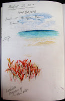
The first day (Saturday) at the beach house was great, but I hadn't yet calmed down enough to paint or even reflect. Everyone went out on Sunday morning, leaving me with my thoughts and my art tools. The view was just stunning -- turquoise-azure-deep blue-aquamarine colors in the sea; sand a beige-yellow ochre color. Lots of photos, just one sketch to capture the colors I saw. Amazing how a sky that's ultramarine blue can provide such cool and transparent colors in the water. Faber-Castell colored pencils.

I love crotons, their range of colors, vibrancy, and almost whiteness where the sun hits a glistening leaf. Created the background of oranges, reds, and a bit of green with pastel pencils (Derwent); used my colored pencils on top. Interesting technique, but I'm clearly still out of practice! Still, this is a journal where I record my impressions. I have enough memories and photos to develop a painting if I want to do so.


When the others returned and were sitting on the verandah, I took the opportunity to sketch my nephew (no resemblance at all -- the eyebrows make him look much older than he is) and my cousin's husband's hat, which fascinated me with its texture and shadows. Then I tried to sketch him under it, deliberately not trying to attempt his features. Is the hat too small? You bet! It needs to be wider than it is. Next time, I must LOOK at what I'm drawing.

Sleepless Night

Over a month since I posted; so much to write. Started building up my creative zone by digging out my keyboard (only 5 octaves, but hey...) and rediscovering the joys of the piano.That energized me so much that I couldn't sleep that night! And I started the countdown towards my vacation -- nearly two weeks in Barbados with family, friends, and REST.

I'm trying to keep this journal as a record of my activities, especially those that build energy. Of course, it would help if I continued reading Cathy's book. I'll get there. Right now, it's posting time.

Watercolor pencils.

Sunday, July 24, 2011

My Creative Map

Bought Cathy Johnson's new book, Artist's Journal Workshop, when it first came out -- downloaded it straight to my Kindle. It's awesome! And while I like being able to carry it around on the Kindle, I'm also glad that I can read it in color on other devices. I've answered the first three questions about starting a journal, but don't feel comfortable posting them. The newest assignment (really, a suggestion) is to make a map of where you want to go and to include any roadblocks or obstacles, or motivators. I was astounded last night when I did this to see what came out.

Here's the upside-down version of the map as well, to make the other bits easy to read.

Sunday, July 10, 2011

Eatin' Indian


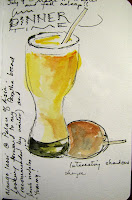
Dinner at the Palace of Asia restaurant attached to my hotel. I do love East Indian food, and the lamb vindaloo was particularly delicious! Sketched the mango lassi that I sipped while enjoying my meal. This one was somewhat unusual tasting, but very very good. Sorry I can't say the same for the dessert. I had been looking forward vanilla ice-cream with mango slices and a mango sauce, but they were out of it. I didn't fancy any of the other desserts so went for chocolate ice-cream. Mistake!! Very pretty in the dish, but NOT good ice-cream. Can we say, "so awful I had to leave half of it back"?

Travellin'

Spent a few hours in the Cincinnati airport yesterday en route to Philadelphia for a conference. I had hoped to take advantage of our layover to do some major sketching, but having had only 50 minutes of sleep on Friday night, I ended up dozing most of the time. I did manage to sketch the face of a woman sitting not quite opposite me about 2 rows away. I think that she realized I was sketching her, so occasionally I looked at another spot and then "drew". I wonder how others handle situations where people discover that they're under observation. Comments, anyone?

 Those airport chairs!! Never terribly comfortable, but sometimes an intriguing subject. The one above was part of a row of about 6 chairs. Luckily this one didn't have to stand on its own, as it has only one long "foot".

Saturday, July 2, 2011

The Night in Battle Creek, Michigan

Wow, what a day! Driving around in the hot sun makes for two very tired people. But clearly not tired enough. We shared information about the various blogs that we follow, techniques that we like, traded recommendations back and forth.
Yummy fruit. I was going for the highlights and darks, but of course made everything uniformly dark, so my overall effect was lost. Part of my problem was that in using complementary colors at the beginning, I probably put too much green in the apple, so it ends up being the same color as the mango, even though it was really a reddish-yellow. Fruits clockwise from the top: apple (in rear); mango (unreadable as such); two strawberries; pear.

Experimented with using a blender pencil and a white pencil (wax) as a sort of frisket, coloring over with both w/c and wax colored pencils. Nice technique... and it works. In fact, I was even able to lift the Inktense blue from the white just a bit!

Top sketch is an apple using a white wax colored pencil to protect highlights. It works well. And when I squint at the sketch, I actually see some roundness. That's encouraging. Vicki and I talked about the Adirondack chairs that she's working on, so I tried sketching a pair from memory. I guess it's not much help if they're facing AWAY from each other, is it?!

And what is this? An intriguing question... can you tone paper enough to be able to use a white pencil on it? Mixed up a thick darkish wash (using my travelling w/c palette) of prussian blue, alizarin crimson, burnt umber, with some green, and laid it on pretty heavily. After it dried, we found that several pencils worked very nicely on it, thank you very much. I did a quick sketch of my troublemaker Numa, though it doesn't seem to look much like a cat. Well, it's the thought that counts.

We finally went to bed around 3 am!

The Day in Battle Creek, Michigan

Spent the first day of July in Battle Creek, Michigan, on a sketchcrawl with Vicki. Such fun, and so glad that I met her at Kristy Kutch's workshop in May! We started off with lunch at Clara's Restaurant (great crabmeat and spinach), then sketched in various places as outlined below. Went to Horrock's and bought fruit to sketch -- and eat! I found Ambrosia apples, my favorite, so of course bought some. (They normally have a short growing season so I find them December-March in my local supermarkets.)

The first sketch at a river. Hmmm... doesn't look much like one, does it? If I did this over, I might make the bushes into a water fountain. And as for those lazy susans... hah! I pencilled in the reflections but didn't get around to watercoloring them in.
Done with w/c pencils and crayons.


The clock tower at Clara's Restaurant. This used to be a train station. I spent a lot of time working on this and plan to complete it later. The guy at left (notice the beard?) was someone who stopped to speak with us. When you sit on the steps of a library, people go in and out, and many are curious about what you're doing. A whole bunch of kids passed by and they were really impressed with our work! Go figure.


Who says garages aren't fun to draw? (No-one.) We drove around looking for a place where we could park and sketch without raising concern (!) or looking odd. :) This old storage barn was calling out to be painted. I should note that the side on the right is only about half the actual width. We did five-minute sketches here and it was a challenge to see what we could do in that time. My first one was the door, then the barn itself -- both in w/c/ pencil. The bottom sketch is with my new technical pen, to see what it would take to create DARKS in pen.

Sunday, June 26, 2011

Day Lily on Dura-Lar

I'd never tried using CP on Dura-Lar film. Used it today when my I wanted to capture some of the summer beauty outside. The film is fantastic... it's FAST, smooth, takes about 5 or 6 layers... and you can use the reverse side as well! I colored with purple on the reverse side to create some shadowed areas; with red behind the leaf to create darkness.

Benefits? Work is FAST. You can erase mistakes. You can draw in a sketchbook and then trace your work... and you're ready to go. I used Prismacolor, Polychromos, and Lyra pencils on it... no problem

The only drawback I can see is that every mark shows. I'll have to work more carefully next time, using better strokes. Next step... Yupo paper. Wheee!

Members Show @ Ann Kullberg's site

I was happy to just make the deadline for Ann Kullberg's annual Members Show. Each member was allowed one entry only. I submitted "Shadow Play", which is based on a photo I took a couple of summers ago. Like anyone who does photography, I love shadows and what they say about the light that causes them.

I'd love to hear your comments on this. Enjoy the show -- there are some STUNNING works there!

Saturday, June 25, 2011

Now what do I do with all the empty tins and boxes?

Forget my last post. I had a brainstorm today and just whipped up the perfect organizer for my colored pencils. The organizer has 18 sections and the colors are (L-R, back to front):
  • pale colors; pinks; purples; neutrals (greens and yellows)
  • yellows and oranges; reds; blues (dark); blues (light); greys (French, other); neutrals (browns and reds)
  • greens (dark); greens (light); blacks, whites, metallics; greys (warm); greys (cool)

 Was this ever easy to make! I used the cover of a standard box of photocopy paper as the container; the measurements are 18"x11.5". Found a large piece of cardboard that had probably come with a shipment of watercolor paper ages ago. Cut two strips 18"x3.5" and five strips 11.5"x3.5". It was a simple matter to snip teeny pieces out of each strip and then put them together, and voilà! Instant organizer. I love it!

It's portable, not heavy at all, and can go everywhere with me. Would you believe that it currently holds 324 colored pencils? Yup: 132 Prismacolors, 120 Faber-Castell Polychromos, and 72 Derwent Coloursoft pencils. I can quickly find the right color group and then it's easy to compare the pencils with each other to figure out which ones I need.

I will probably end up dividing the yellows and oranges into two groups, but that's a project for another day, along with strengthening the sides of the container so that they don't bow out quite as much.

Color me happy!

Sunday, May 15, 2011

Colored Pencil Tips

I've just been reading this month's issue of Colored Pencil, a wonderful magazine created by Ann Kullberg*. Each issue contains a gallery of CP work, and following a link to a painting of a monarch butterfly (very much like one I'm trying to work on) brought me to Denise Howard's website and some amazing CP art.

One post in particular caught my eye, on organizing colored pencils. I have collected several sets in the last two years, thanks to a generous friend and my two wonderful cats, but have to keep them in their original containers since I am torn between organizing by color (meaning that different brands are together) and displaying by brand (in which case I could as well keep them in the sets). This post expanded on a notion that I've seen elsewhere to use PVC pipe, but this time the pipe is really wide (2.5 inches). And now I have the happy notion of placing them on a circular piece of foamcore board for better access to the pencils. I'm already happy imagining a nice lazy susan where I can have pencils sorted by primary and secondary colors (maybe even warm and cool, hmmm), neutrals, greys, and in the center a logical place for rulers, erasers, and the other accoutrements that we tend to acquire.

Just thinking about this has my creative juices flowing, so it's just as well that I won't be able to go to Home Depot for a few days yet.

*I cannot recommend Ann Kullberg's website and magazine highly enough. I've been subscribing to Colored Pencil (formerly From My Perspective) since the beginning of 2010, and recently took advantage of a marvellous sale to purchase 11 CDs of back issues, so now I have the entire set. (Yes, I like to collect sets.)

Wednesday, May 4, 2011

Well, they're not shakers but they do the job


The Every Day in May challenge is on Day 4 and I'm keeping up so far. I dug out my poor little combination salt shaker and pepper grinder... both sections were empty. I season my food when I cook it (whenever that is), so there's no need to add these condiments at the table. And it's a pain to keep refilling them; the jumbo size works well!

Lessons learned from today's exercise:
1. I'm getting a bit better with the darks. I'm somewhat hampered by my range of colors since I'm using Koh-i-Noor colored pencils and there's no rich deep red like Tuscan Red or Alizarin Crimson. Nonetheless, I think I conveyed the idea of the multicolored grains without drawing each one. (Yes, look carefully and you'll see that I started out doing that. Found a quicker way.)
2. These colored pencils are quite soft and thus don't maintain a sharp point. I'm inclined to try Derwent Studio pencils another time to see if they'll work a bit better on this paper.
3. The paper! 74lb which should take a few layers before crumbling. I think it does, but I don't think it has a really nice texture. It's not rough. Just... somewhat dry. And gets dirty VERY easily!
4. I do like the composition. It could do with some improvements in many ways, but I like cutting off both containers at the sides and then one at the top and the other at the bottom. I may explore this idea further.

Koh-i-Noor colored pencils and Micron pen

Tuesday, May 3, 2011

How I keep fit


When you have two sets of stairs in your house, you HAVE to climb them and thus you get an automatic fitness workout. Thank heavens!! So, welcome to the top of the stairs leading to the second floor landing. Once again, my darks just aren't quite there. The flowers are a bit iffy as well. I added the pot because the area seemed bare, but obviously I didn't have a real model to draw from! Baby steps.

Koh-i-Noor colored pencils.

Monday, May 2, 2011

More power to the plugs!


Day TWO of the Every Day in May challenge: Draw a power plug. These two were side by side, peacefully on my desktop, and so naturally there was an instant title...

I found a sketchbook I haven't used in a few months, so I decided to make an EDiM kit: Koh-i-Noor colored pencils (set of 24), pen, pencil and various necessary accoutrements.

Pears for Vicki

Had these two pears sitting in a photo for a while now... from a colored pencil workshop that I took about a year ago. Changed some colors and the setting, did a lot of burnishing.

I want to reach a stage where my strokes don't show. I know it's one technique, but somehow they look very scattered. It's all about control.

Prismacolor and Polychromos colored pencils on yellow cardstock.

Sunday, May 1, 2011

Every Day in May #1


Soap.

One simple word, so many ways to think about it. This is a bar of my favorite soap (you may need to rotate the image clockwise to figure it out).

This is done with colored pencils (Faber-Castell and Prismacolor) on purple paper.

Lessons learned:
  • NEVER, NEVER use thin paper. I chose the purple because it matched what I wanted to do, but it took only about 3 layers of pencil, and the surface was unstable. Those little dots scattered throughout are bits of the paper that came off and were pencilled in... and I was using a VERY light touch.
  • Get with the darks. Even with some post-scanning enhancement, the picture doesn't look the way that it did on the paper. Of course, my darks couldn't be as good as I'd have wanted, because the darned paper wouldn't accept any more!
Well, there are 30 more days to go. And improvement each time.

Monday, April 11, 2011

Every Day in May

A new series of EDM challenges, Every Day in May, is just what I need to get started again. I can do this. It's just 31 days, right? And each day has only 24 hours, so I'll be done before I know it.

Wish me luck. And excitement!

Revitalizing myself

Went to the 25th Annual Juried Exhibition of the Chicago Calligraphy Collective yesterday. What a time that was! It was coordinated by our local calligraphy guru and teacher, Anne Binder, and 6 of her students accompanied her. It was a pleasure to watch Anne "do her thing" as one of the past winners of the Purchase Prize -- several of those winners were there and we had the opportunity to watch them in action as they "calligraphed" on a huge board.

Four calligraphers also did small demos. I was struck by one artist who used graphite overlaid with graphitint pencils that she then wet and (once dry) erased. Opened such possibilities for using my own graphitint in new ways.

Followed the exhibition with a trip to a paper store and then to Blick. Yum!

Have now started a painting of two pears (working title="Complementary pair"). Yes, we're one-third of the way into 2011 and this is not only my first post for the year, but my first post in A WHOLE YEAR! With any luck, that will change.